
Last Updated on 4. May 2023
In this article, we provide a brief overview of the A12 Enterprise Low Code Platform’s optimized filtering and search capabilities for mobile devices.
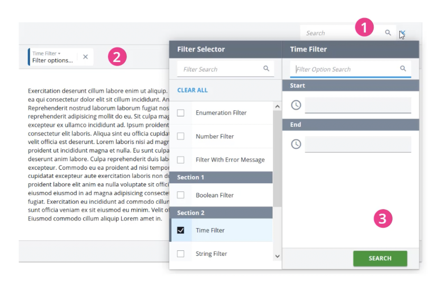
The A12 Enterprise AI Low Code Platform provides powerful filtering and search functionality for desktop and tablet, which can be customized for the specific enterprise application via the modeling tools. The screenshot above shows the example of an added time filter:
1. Search input + filter option (icon)
2. Filter bar (list of selected search filters)
3. Filter selector (detailed settings of a selected filter)
After selecting a filter in the left column, it will be displayed in the Filter Bar (2) and the assigned filter options will be shown. In the example of the date filter, this is the option to specify a time range with specific start and end points.
Complex search queries can also be created via the free combination of various filter and search criteria – a frequent requirement for enterprise applications, e.g. when searching for article or customer data.
The display and functionality for mobile devices
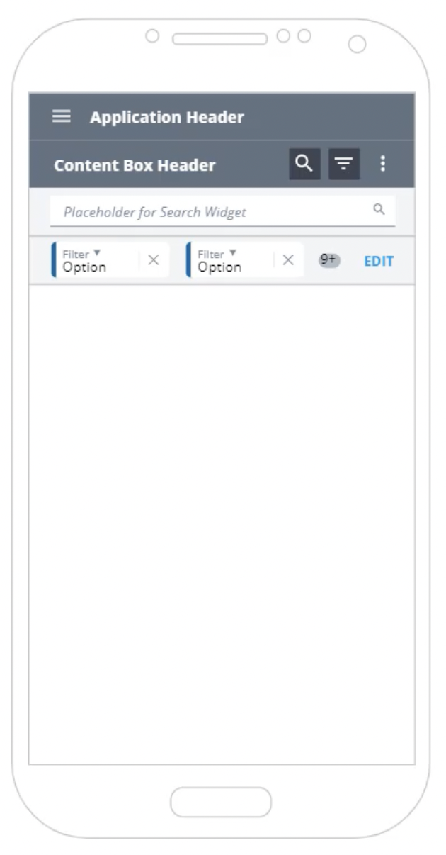
Due to the limited screen space on mobile devices, A12 provides a specially adapted version for this (responsive design). The search and filter buttons are located here in a compact version in the header of the content field.

By default, the search is collapsed to save display space.
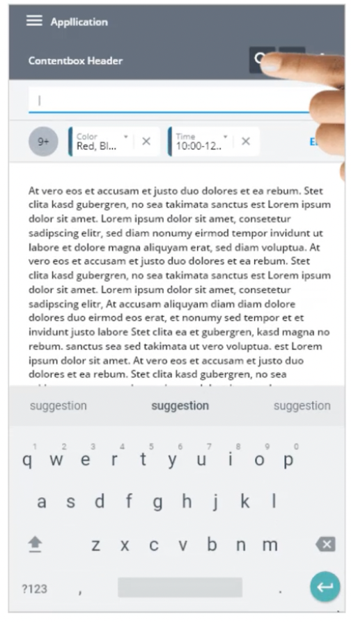
When the search button is tapped, the input field for the search and filter options appears below it. Another tap closes the search input again. When collapsed, an indicator (blue dot) shows that a search is active.

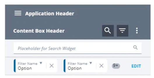
The mobile filter bar supports the same options as the desktop version. However, it displays only one compact row of filters, the remaining filters are represented by a counter badge (“9+”):
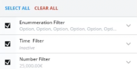
After tapping the EDIT button, a modal overlay opens, displaying the available filter options. Unlike in the desktop version, where the filter selection and filter options are displayed side by side, on mobile devices they are combined in a single list view and displayed one below the other:
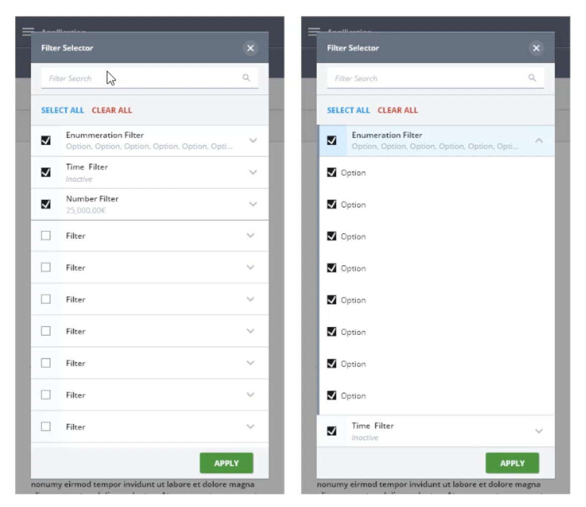
Active filters are always displayed at the top of the list, inactive ones below. A tap on a filter opens the filter options via an “accordion pattern” that allows the user to quickly expand and collapse the selected filter options. This allows for quick work even on small screens.
The mobile interface also always displays the selected filter options directly in the filter entry (second row) to provide a better overview of the selected choices when collapsed.
This brief overview of the filter and search functions for mobile devices makes it clear how the A12 UI/UX is continuously optimized for enterprise applications and thus delivers many functions out-of-the-box that would otherwise require complex implementation in the project.


